I love it when I get to share real life examples of what goes through a designer’s head. Just because we do this day in and day out doesn’t mean we don’t get stuck. Admittedly, it is much easier to make decisions for a client because one, we are on the clock and not about wasting your money (trust me, we’d rather you spend the cash on a fabulous piece that looks spectacular in our portfolio, IG feed, potential publication, and that we get tons of accolades for getting it into that room.) But as I told you before and I’ll tell you again (and probably again), I am a terrible client. (And my husband might be even worse. He seems to not have an opinion on anything I can’t decide on, but when I show him something I am certain about, he’ll utter a maddening, “huh.” I’ll keep my response to myself.) So, I found myself stuck.
Much like the mood board, if I find myself between designs, I may create two Design Boards, as it is the easiest way for me to make selections and see how things go together. This is how I do it anyway but I will typically work off of one. In this case I had two visions I just needed to get out, so I went with it. When designing for a client, this is where the bulk of my time is spent. I have already added all the potential products and finishes to a Pinterest board so that they are conveniently in one place with links directly back to my vendors. If you forgot how handy dandy this process is, take a moment to read Step 2 and have your mind blown. (I mean, maybe not, but I think it’s pretty ingenious for my organizational process…
Alrighty…I have two design boards. Now what?! Any guesses…oh yeah, that foundation. What was that class? Don’t raise your hands all at once now. Why yes, Linda, the Mood Board! Remember? It is used for reference throughout the design process and this is a glowing example of how I would reference it. Which vision of the kitchen and dining aligns with the agreed upon direction of the space? Now, I will also admit (because honesty is my policy around here) that I skimped on my Mood Board. Which is also why I should have started with it…#lessonlearned. I took a look and thought to myself, you really just threw some stuff you liked up there and may not have full thought it through, however there is still a cohesive theme that is keeping me on track and guiding my decisions. It is really a game of elimination and the Mood Board is what helps me immediate eliminate selections that, basically, wouldn’t look good in the mix.

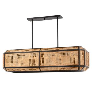
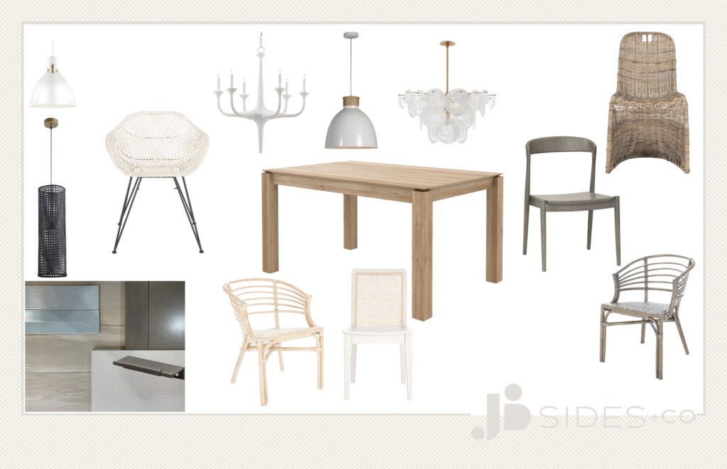
And sometimes we need to go back to the drawing board. I found a light fixture for the dining room early on and I was SET on using it, but I just couldn’t make it work. I tried, and I tried, and I tried. Wanna see it?! (Just so I can say I “used” it. Isn’t it a beaut?)
I had already suspected I wouldn’t be able to “make it work” a la Tim Gunn, and had Pinned some others along the way, but they just weren’t doing it for me. So, I had to go back to the drawing board with a fresh set of eyes and a clearer idea of the design. And this is where my handy dandy organized bookmarks come in. No reinventing the wheel here. I go back to my trusty vendors, but I search with a different mindset. Just like I do for each client. I found some more options keeping in mind the natural elements I want to incorporate. While I went in what seems like a completely opposite direction, the consistency in finishes, elements of nature, and shape is what makes the new fixture cohesive.
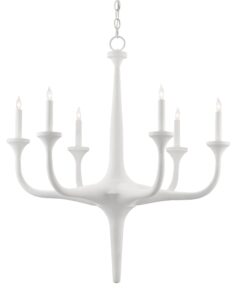
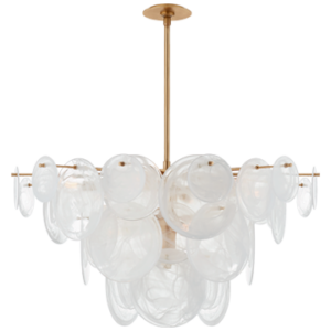

A few of the new considerations. Organic lines + natural elements.
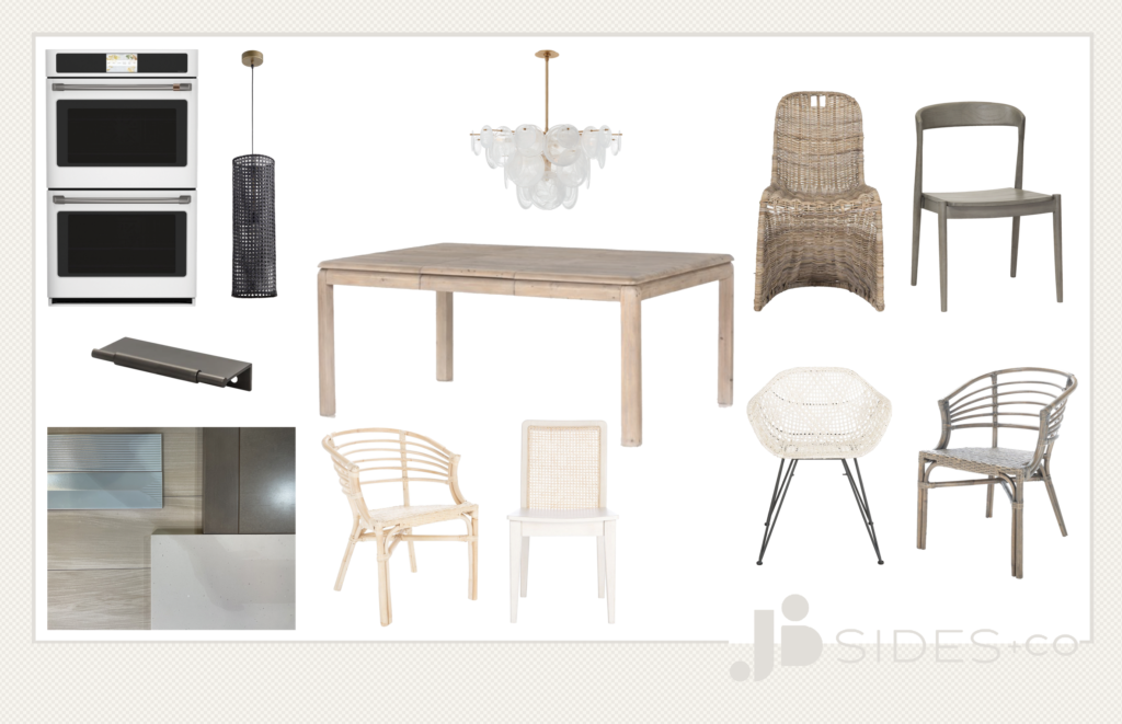
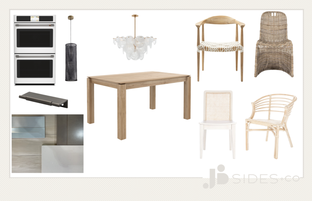
So, here I am. I have three cohesive designs that all have pros and cons. What are they and how do I reconcile them? How do I get down to what I will present to the client? First step, reach out to a trusty designer pal. Yup. Enlist the help of another pro. We all do it. I told you-it is a lonely world at times and our brains get overwhelmed too! (We literally have support groups for this. Our online community is ahhhhhmazing.) Below you can see where I landed and then where my trusty pal helped me land. These are a few of my iterations. It is like a game of “Spot the Differences.” Ok, maybe it’s a little more obvious, but these are the subtle changes and details we make on your project that makes all the difference in the end, whether it be wow factor or cohesiveness. I cannot stress enough how important it is when sourcing from several places to make sure those pieces go together just so. Similar enough that the table and chairs look like they are meant to sit next to each other, but not “matchy-matchy” (there are exceptions), or different enough in a way that is unified and not jarring. (More on how to make that happen later. It’s in the details people. All in the details.)


And because I #needhelpchoosing, I need to share the criteria and what some of vacillations are, so here goes:
Need: Expandable dining table. (The pickings are slim people.)
Want: Natural woods, organic lines, casual yet refined, kid friendly, mixed finishes, not trendy (Remember, I see it all. It’s my job. I want a unique space not only for myself, but that’s why clients hire me. To not have a space like their neighbor’s.)
Ethical tenets: To the extent possible, my furnishing choices are non-toxic, sourced from North America, use sustainable or responsibly sourced materials, and the manufacturers are working towards practices that are better for people + planet.
- All the finishes achieve the natural element I want to incorporate into the space, yet I find the space looking very monochromatic and neutral-which is not a bad thing, I am just surprised at myself for moving in that direction. In order to add some more interest, I plan to source a patterned and perhaps more colorful dhurrie for under the table.
- I also see that the finishes are warmer (more yellow) than intended or too whitewashed.
- One of the tables is from a vendor I am looking to get on board with that makes a beautiful product that is both sustainable and non-toxic. One is still a quality table with less wellness claims, and one is made overseas and from a vendor I avoid using.
- I would like to mix and match chairs. I love a fab head chair. I am not sure that any of these are hitting the “fab” mark, but since the overall vibes are refined casual, the head chairs don’t need to be over the top or different at all.
- One of the chairs I love only goes with the table I don’t want to use.
- One of the chairs I love was a top pick by my designer pal, but I am still having difficulty seeing it fit in.
- One, maybe two, of the chairs I am seeing more and more often. No bueno.
- One of the chairs I fear is not refined enough, but it goes great with another as a “mix and match.”
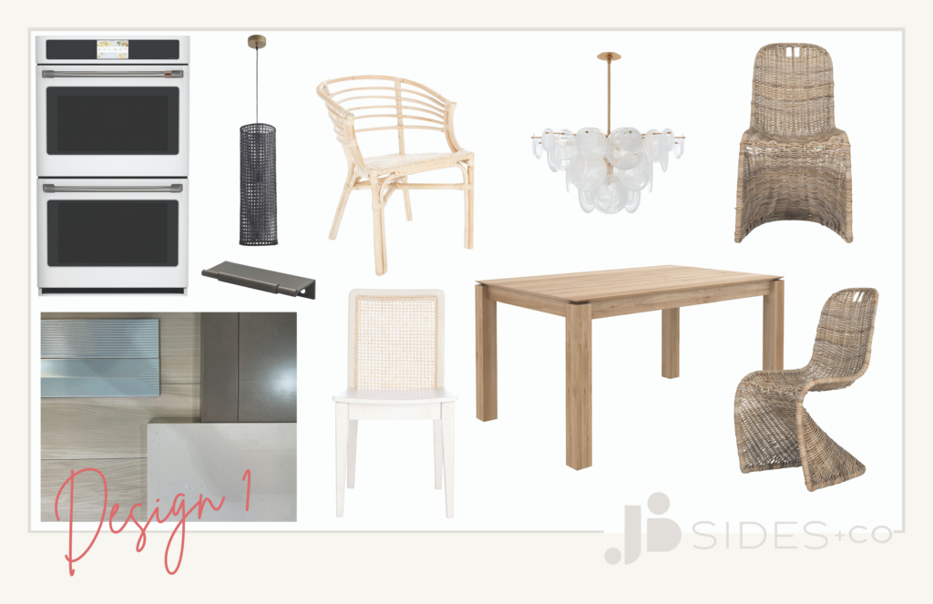
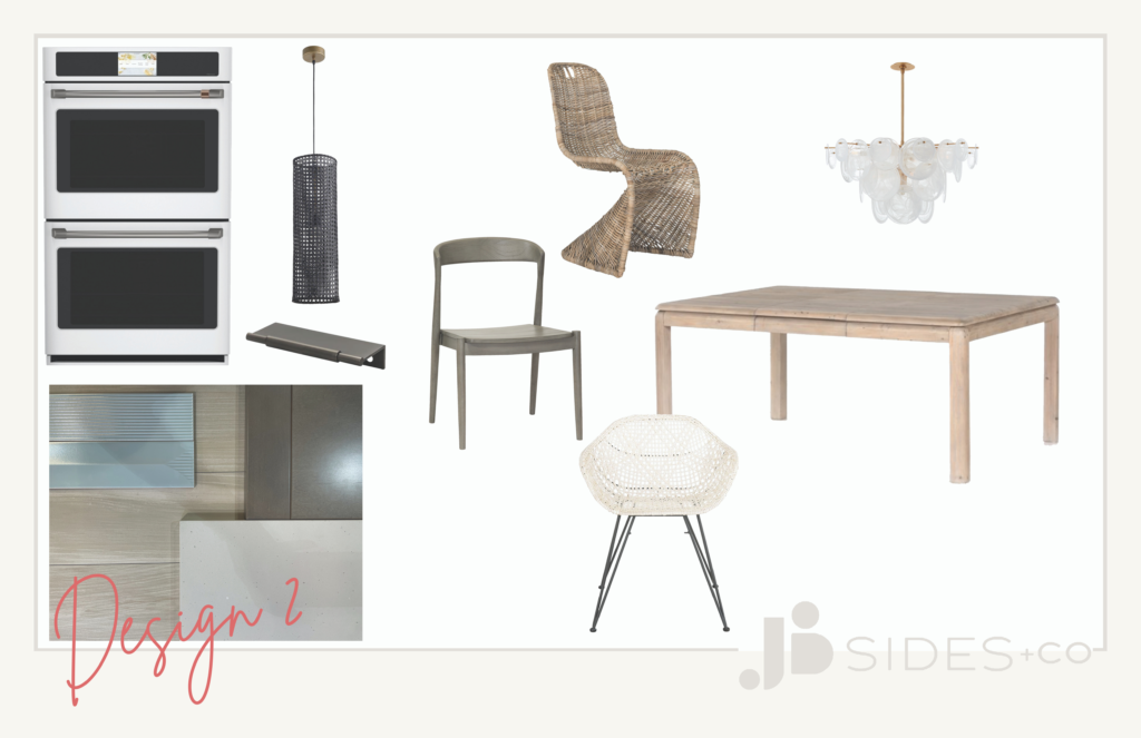

Yes. I know it jumps from Design 2 to 4. See, that’s what happens-I intended to put up two, I ended up with four, and I eliminated one as I was writing this! As long it takes to source items, we can also make split-second eliminations making our time more efficient. (Pssst! Referencing the mood board regularly also helps in this decision making time.)
Now, keep in mind, these design boards are part of my process. I consider them cat scratch and not close to what is presented to the client. Sometimes we have a clear picture of a design and sometimes we need to go through several iterations before we even present to the client. As a client, it is important to understand that when we come to you, we are coming with our best and close to final. There are always options waiting in the wings, but when you ask us to revise, revise, revise, trust me-we already have. (And on another note, if your designer isn’t hitting the mark, it warrants discussion. Design aesthetic, budget, needs aren’t being clearly communicated or understood. Your designer is likely having the same frustrations and it is possible you two are not a good match. And guess what? That’s ok!) So that you aren’t left completely hanging
So, here I am totally confused, unsure, and not super stoked about my options, but it happens. That is why I have to look for that piece de resistance to tie it all together. Will it be the area rug? Will it be the accessories or artwork? Perhaps some unexpected window treatments? This room is far from complete and the silver lining is that a neutral palette does allow me to play with color and pattern in an unexpected way that will make heads snap to attention as they walk into the space. Or perhaps this area is meant to be calming a subtle, comfortable and inviting. What feeling does it evoke for you? What options would you choose?